Feedback buttons are icons or tabs that are visible on the pages (and dashboard) of your online course. They make it easy for your customers to give quick feedback on your course without leaving the page they are on.
Here are 10 reasons why you should use a feedback button on your online course:
- Get early stage ‘big picture’ feedback
- Quickly identify page-level mistakes and inaccuracies
- Get customer satisfaction ratings
- Open another line of communication between you and the customer
- Make it simple for your customers to give feedback
- Make it easy for you to collect feedback
- Simplify the job of your help desk
- Avoid being too passive and hands-off
- Easy to install and inexpensive
- Discreet user-centred way to get feedback

1. Get early stage ‘big picture’ feedback
Getting early stage feedback on your online course means you can identify what your course is doing well, as well as any areas that may need improvement. Feedback from customers can also give you the confidence to know whether your course is ready to launch with a wider audience.
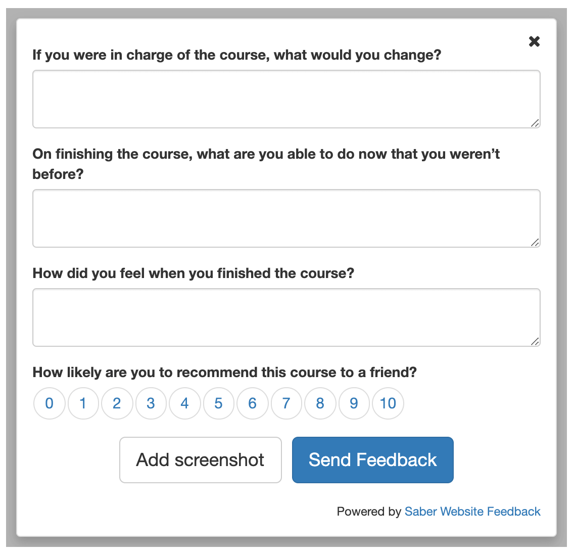
Feedback buttons make it easy for you to get early stage feedback. Key to getting as much actionable data as possible is to customise a short form that invites ‘big picture’ feedback. It should be simple, focused and quick to fill in.
Feedback forms are highly effective no matter which industry or niche your course is targeting.
To give one example: AICPA is the world’s largest member association representing the accounting profession. They run the Finance Leadership Programme which is an online learning platform for students working towards their CGMA Designation.
Christopher Roberts, learner success manager at AICPA, explained that:
When the programme was new and we were still building it, we wanted to add new features. So we initially asked students going through the programme to suggest improvement ideas through a feedback button.
Read the full case study here to find out more about how feedback forms helped them to improve their course.
2. Quickly identify page-level mistakes and inaccuracies
There are almost certainly mistakes in your online course, including grammatical errors, typos and unclear meaning. There will also be usability problems, including videos that don’t play on all devices, audio with fuzzy sound quality and pictures that take ages to load.
Feedback forms can help you to quickly identify these issues.
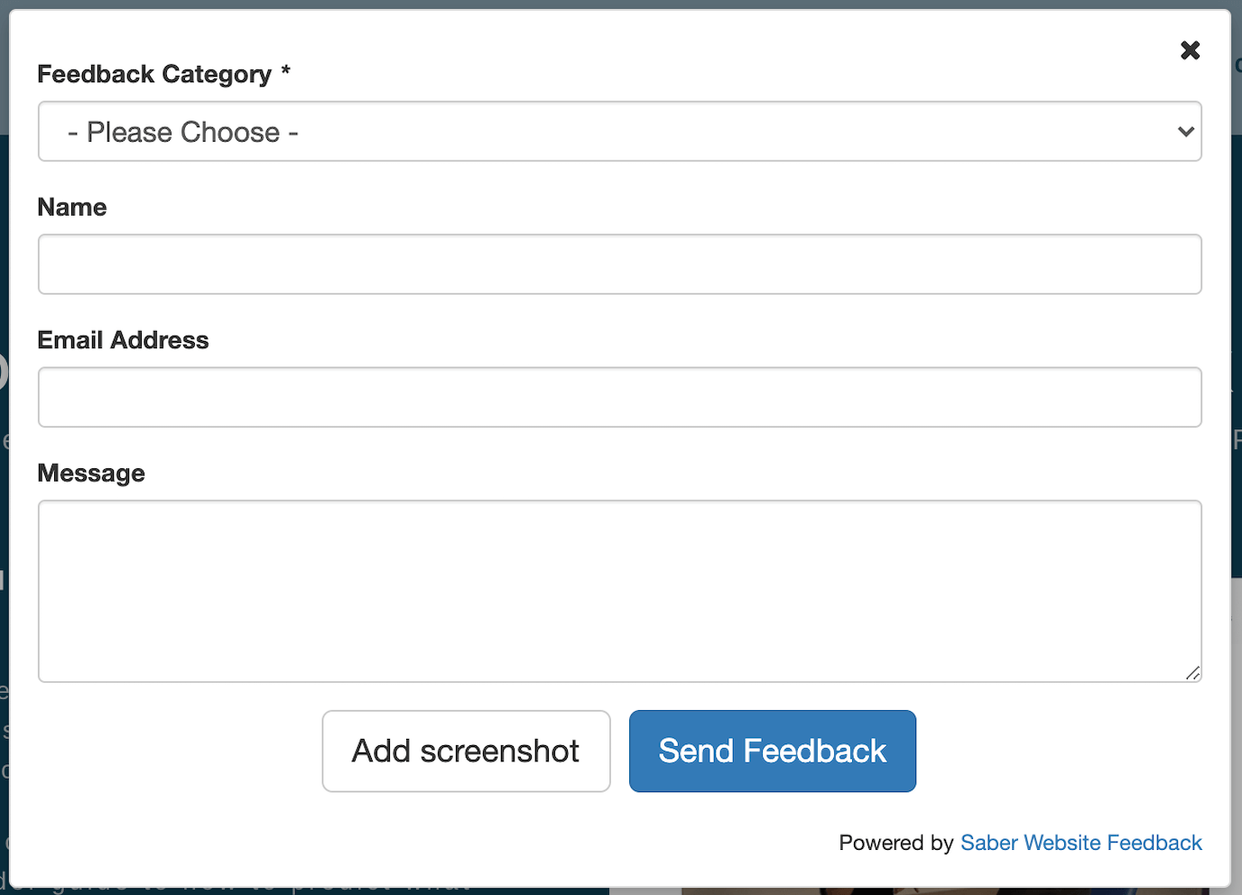
One simple way of doing this is to use a feedback form with a predefined dropdown menu to clarify what problems your customers are experiencing. If your customers are logged in, you can program the name and email box to be pre-filled.
If you give your customers the chance to alert you about these issues, then you can quickly fix them and ensure your content is as accurate and usable as possible.
Dr Edward Banham-Hall, hospital consultant and course director of Clinical Skills Pro, explains:
One customer noticed that the European Society of Cardiology had recently updated some guidelines, and that had made some of our explanatory text outdated. They simply logged a note through Saber (a feedback button provider) and we were able to redraft that bit of text, resolving the issue within a few hours of the change in management guidelines! That compares very favourably with our competitors who continue to have outdated information in their resources and no mechanism to directly link customer feedback to specific elements of their course.
Read the full case study here.
3. Get customer satisfaction ratings
You can only assess the quality, accuracy and value of your course by asking your customers for feedback.
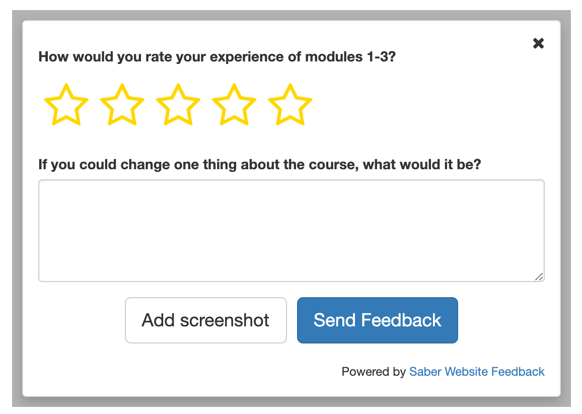
Rather than asking customers at the end of the course how they would rate it, you can ask mid-course. This helps to get more focused feedback about specific parts of your course, and helps users to process smaller chunks of content (rather than trying to remember the course as a whole).
By asking for feedback mid-course, you may end up with feedback from customers who would not have reached the end. This feedback is high value as it helps you discover weak, off-putting elements in your course that need immediate improvement.
You can keep your form simple, like the example above. Simple forms tend to get more answers, but that doesn’t mean that the questions can’t be highly relevant. Tools like Saber Feedback will enable you to use form logic to show your customers different questions depending on their answers to the star rating question.
If they have given you 1-3 stars, follow up with questions probing why they have had a poor or mediocre experience. If they have given you 4-5 stars, follow up with questions asking what they can do that they previously couldn’t.
Not only is this helpful feedback, but it’s also great content for your marketing campaign!
4. Open another line of communication between you and the customer
Feedback buttons can be used on your customers’ dashboard, as well as on course pages. This means your customers always have another way they can get in touch with you.
You can even connect your feedback button tool with your helpdesk software, if this is supported. All feedback from your ‘contact’ page as well as your feedback button will then go to one place.
Even though your online course may not have any live elements, your students should feel they can quickly reach you and your team. Giving your customers a few options for this will improve their user experience.
5. Make it simple for your customers to give feedback
Generally, the harder something is for someone to do online, the less likely they are to do it. This is why feedback buttons are so popular. Your customers simply have to click a discreet button, fill in a short form, and that’s it.
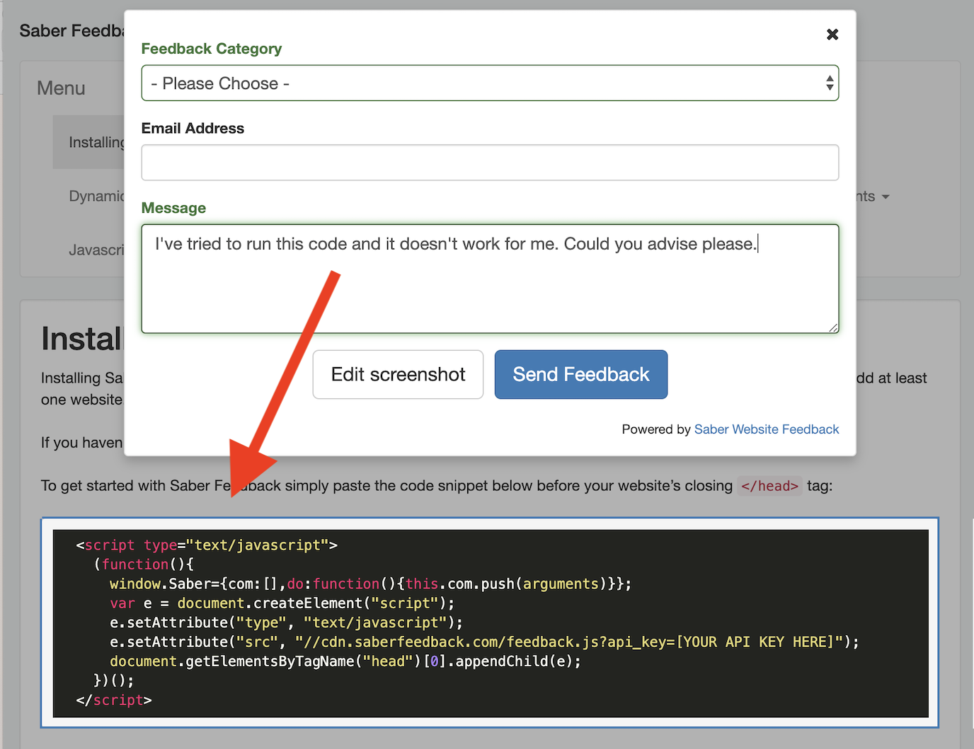
Some feedback buttons (like Saber Feedback) also have screenshot functionality. Your customers can simply take a screenshot of an issue and follow up with a short message. This takes away the need for them to spend 15 long minutes trying to describe the problem in words.
6. Make it easy for you to collect feedback
Feedback buttons are designed to make it quick and easy for you to collect valuable feedback from your customers. They collect feedback in one place, such as a dashboard, a specified email account, or even in your favourite project management tool if your feedback button supports integrations.
Feedback buttons also allow you to be specific about what type of feedback you want to capture. Feedback forms should be easy to customise, allowing you to decide whether you want a heads-up on bugs or a list of feature suggestions.
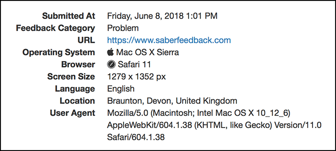
As well as supporting screenshot functionality, some feedback button tools will automatically capture information that will be helpful to your team in diagnosing and fixing problems. This meta information includes:
- Information about the user’s device
- Information about the user
- Browser plugins
- Page URL
- When the feedback was submitted
- Events (including any Javascript errors)
7. Simplify the job of your helpdesk
Does your helpdesk struggle with customers trying to take screenshots of the problem they are having? Do they want to know what URL your customers are on?
If so, feedback buttons can save your customer support team time. This is usually the case if you choose a feedback button that makes it easy for your team to identify problems without going back and forth with customers, or having to navigate between dashboards.
In this article, we look at how a feedback button improves the customer support experience offered by Zendesk.

8. Avoid being too passive and hands-off
Although online courses can seem like a perfect way to get ‘passive income’, you don’t want to come across as uninterested in your customers and disengaged. This can damage customer satisfaction ratings and impact sales.
Feedback buttons are an effective way of showing customers you care about what they have to say, without having to invest in a 24/7 customer support team. Even just being able to see a feedback button can be reassuring to customers as they make their way through your course.
Having a chatbot can work in some use cases, but they set up high expectations (that your customers can speak live to someone, or get the answer they need) which are not always fulfilled. Remember: a chatbot is only as good as the intelligence you feed it.
9. Easy to install and inexpensive
Website feedback buttons are usually easy to install. Most involve simply pasting a snippet of code into your website.
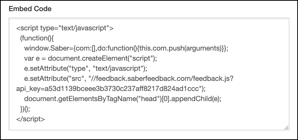
Some are also platform agnostic, so you should be able to install them on your online course, no matter what platform or technology you’re using.
Prices vary, but are usually affordable. Saber Feedback starts from $49/month and works on nearly all online courses. Here’s our list of the best feedback widgets, so you see what other companies charge.
10. Discreet user-centred way to get feedback
Forms and chat boxes that ‘pop up’ based on business rules (such as when you plan to exit a page) are very common. However, they can also be annoying for users, so need to be implemented with care.
They are not suitable in instances where they divert the attention of your users whilst they are concentrating on a task – as is often the case when they are moving through an online course.
Feedback buttons, in contrast, are discreet and user-centered. They are there if needed, but only pop up a form when triggered by your customers.

Want to know more about feedback buttons? You can read our definitive guide here.
Try Saber Feedback – we have a 30-day free trial
Saber Feedback supports screenshots and feedback in different languages. It also connects with popular product management software like Jira, Trello and Slack. See pricing.